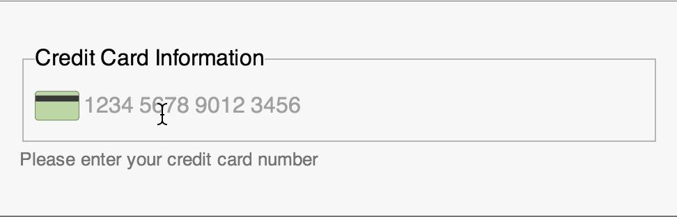
Payment forms are critical on mobile apps, to sell products online. Conventional payment forms have at least 4 input controls — Name on Card, Card Number, Expiry Date, CVV and in some cases, even Card Type — Visa, Mastercard, American Express and so forth. We seek card type although we can detect which type of card it is using first two digits of the card number. We seek detail to this level in the name of providing freedom and control to users.
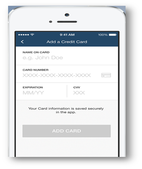
Typing through each field, by looking intermittently at the card and the payment form to ensure correctness can be a daunting task. Payment form listed above can be simplified by reducing the number of input controls from 4 to 1.
Great! It’s a given that this single input control gathers all the information previously done but in a more elegant and simplified way.
Interaction Design Patterns
Good experience only begins from here — the single input control. Four intuitive interaction design patterns can be used to improve the input experience further.
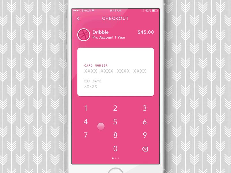
1. Contextual Keypad
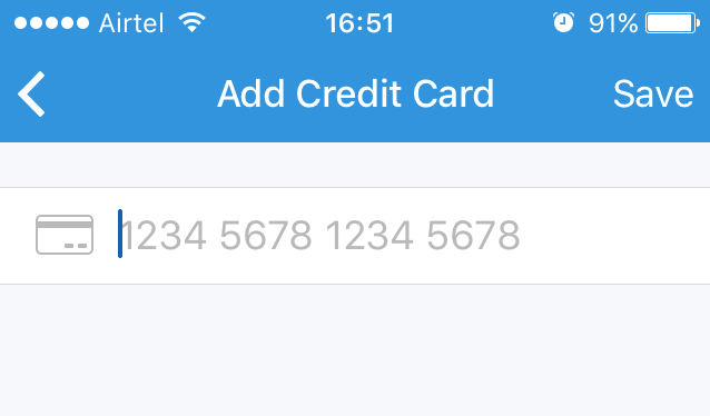
Tapping on the card number field displays a keypad. A lot of mobile apps display qwerty type keypad. The user has to switch to the numeric keypad with few taps to enter the card number.
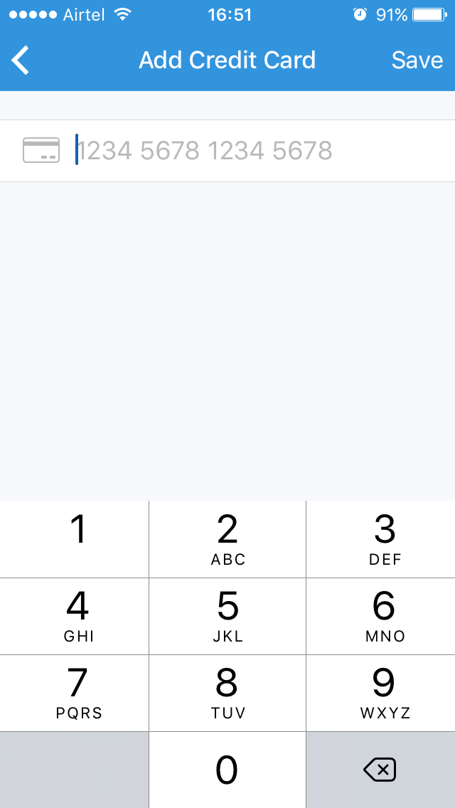
Reducing the effort required to switch between multiple keypads while entering input is a big relief to users. Displaying a numeric keypad (input type=tel) since.
2. Input Masks
As a user types the card number, after typing first 4 digits, he/she pauses to decide whether to give space or hyphen symbol. The user needs intuitive guidance here on which separators (space/hyphen) to use and how many digits are remaining.
Input mask is the answer. Input mask can be implemented in many ways:
- Use ‘XXXX-XXXX-XXXX-XXXX’ and gradually reveal the input structure as user types along
- Use real text like ‘Expiry Date’, ‘CVV’ to hint users
- Auto-populate card logo based on card number as user types first two digits of the card number. This provides feedback to the user that he/she has indeed, entered the right card number.
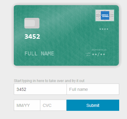
3. Animation
An improved design pattern for payment forms is to introduce animation using card metaphor by designing a virtual card layout. As a user enters the data, it is auto-populated on the card to give a real card visual experience.
4. Machine Input
Tired of typing input manually? There is a simpler pattern :). The built-in camera on mobile phones can be used to retrieve card information by just scanning the card.
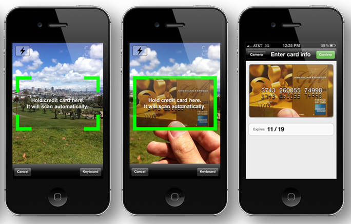
The user doesn’t need to enter card number manually anymore. Many mobile apps are adopting this approach these days [This approach might need intense machine learning algorithms to work with precision.]
Using small/big fingers on small screens to perform input operations can be challenging for many users. Payment forms are particularly risky given the secure nature of operations. Intuitive interaction design patterns listed above can soothe stressed out users by simplifying payment forms to a large extent.
How simple are the forms in your apps?

