19 February, 2019

I am a Google Developers Expert!!!


This article was originally published on Linked In.

Usually, I do not use multiple exclamatory marks to express emotions. Today is an exception!

Just when I was wondering what should be the first blog post for 2019, I realized I completed 10 years in blogging. I created the blog 'Curious Tester' on 6th February 2009. 10 years later, I have written more than 250 articles on my blog, plus another 50+ external publications on corporate blogs across the world. I am losing count! What a journey it has been! I thank all the readers who have encouraged my writing for this long. BUT... today is special for another reason - where my writing journey led me to...


I am super thrilled to share I am a Google Developers Expert in Interaction Design. I have been active in the Google Bangalore Community for a couple years although sporadically. I never expected that one of the evangelists who followed my work, would recommend my name to this program. After clearing five rounds, here I am, recognized for my work in Interaction Design.

In the past five years or so, Interaction Design has become the soul of my work. Thanks to the strong foundation created by Donald M. Norman, David Rose, Dan Saffer, Golden Krishna, Luke Wroblewski, Alan M. Cooper and Steve Krug, I started my Usability journey in 2009 at a startup that was building remote automation projects. While usability was not a quality criteria, I learned *something* was wrong with *some* features and started to read Steve Krug's book, 'Don't Make Me Think'. This led me to talk to few users (B2B though), which in turn led to finding usability problems and thus began my interesting journey in UX (just usability at the time).

This new interest in usability continued in my next startup where my mentor Pradeep Soundararajan noticed a spark and nurtured it. It was in this role that I ran multiple usability and user research projects for many Indian and US based startups. The next role took me to setting up a dedicated UX Competency Center from scratch, where I executed and led multiple projects leading to happy customers. Here I was, learning about usability, user research and user experience on weekends and implementing my learnings at work on weekdays. I was fortunate to attend the first design course led my Donald Norman (was it Udacity or Udemy, I don't remember), followed with reading many books by UX giants I mentioned above. Last year, I also completed my specialization course in Interaction Design (University of California San Diego). Again, I was fortunate, as this course was led by Scott Klemmer, a student of Donald M. Norman. An year later, this is where I stand. I cannot believe most of what has happened since the time I started a blog back in February 2009. But I do believe in this:

"When you want something, all the universe conspires in helping you to achieve it."
Paulo Coelho
Many people make an impact on our lives. My heartfelt thanks to my mentor Pradeep Soundararajan for inspiring me ever since I wrote my first blog and for being a major part of my learning journey. Thank You Pradeep, for gifting your precious time to me!

Many organizations make an impact too. All my employers played a great role in my work. Amadeus, my current employer has been very supportive of my work. I am amazed every time I think about how the organization has grown from 2 people to 2000+ in roughly 6 years and continues to nurture great talent in the technology space. This is possible thanks to the fabulous leadership team and the talented people working here. I am happy to be a small part of it, shaping the future of travel for future generations to come. Thank You, Amadeus. You humble me!

My super lovely team at Amadeus created this lovely poster for me. I am extremely grateful for the amazing support and love I have received so far, throughout my User Experience journey.


I can't thank enough - all the simple people I have met, interacted with, worked with, inspired by, challenged by and impacted by. There are hundreds and thousands of colleagues, mentors, leaders and Dronacharyas who inspire me to do better each day. Special thanks to my chaddi buddies (they know who they are) for always being there for me.

"If I have seen further than others, it is by standing upon the shoulders of giants."
Isaac Newton
A Big Thank You from to each one of you who has touched my work and my life in some way.

Here's Wishing You All a Great 2019!


15 October, 2018

We Don't Need Mobile Apps. Do We?


A product evangelist I recently spoke to, as part of a technology forum asked, “Why do we need mobile apps?” At first, I got into an argument on how the mobile apps are changing the world. Changing the world – yes to some extent. But are mobile apps REALLY changing the world? Am I saying that creating another billion mobile apps will wash out out poverty, reduce crime, provide reasonable healthcare to senior citizens or other valuable benefits to the society? May be not. I kept wondering about this for next couple of days.

This article is not a justification to the million dollar question, “Why do we need mobile apps?” This is a view of how I think mobile apps can impact the world in its own way.

We need mobile apps for three reasons if not more:

  1. People are mobile and expect products to be accessible on the move
  2. Mobile app is another new channel
  3. Mobile app is a strong touchpoint in customer experience

Let us look at each one in detail.


People are mobile and expect products to be accessible on the move


According to a study done by Statista in 2018, the number of mobile phone users in the world is expected to pass the five billion mark by 2019. In 2016, an estimated 62.9 percent of the population worldwide already owned a mobile phone. The mobile phone penetration is forecasted to grow, rounding up to 67 percent by 2019. China was predicted to have just over 1.4 billion mobile connections in 2017, while India was forecast to reach over one billion. By 2019, China is expected to reach almost 1.5 billion mobile connections and India almost 1.1 billion. 

Most of the mobile market growth is attributed to the increasing popularity of smartphones. The users are all over the smartphones. So where should the products be?


The products better be on the smart phones.

Consider Oracle, SAP and other enterprise giants. Each one has built a mobile offering in the past 10 years for better outreach to their customers and users.


Mobile app is another new channel

A channel is the medium of interaction between a customer and an organization. Mobile app is a key channel in today’s world.


Each organization has its own set of relevant channels built over a period of time. Some prefer brick and mortar stores, while others are on the internet. Even on the internet, organizations are faced with the question of whether they must just have a a website or a mobile app, live chat support, chatbot or some latest technology offering. Take the example of Pepsi soft drink. Users can buy it from supermarkets, retail stores, order it from online marketplaces or vending machines placed in public places. Now, Pepsi might be faced with the challenge of adding a mobile app as an additional channel to users. Just adding a mobile app offering may not increase the sales right away, but it does become a new channel to users using mobile apps.

Note that adding a mobile app may or may not generate revenues in many industries. It is up to the organization to decide if adding a mobile app works well with the overall product strategy and if it can impact long term sales and revenues in a positive way.

Some organizations may even create their own unique channels to support their business. For example, Amazon’s dash buttons are Wi-Fi connected physical devices that allow users to reorder a product from Amazon with one press. Take a look at the video HERE.


Mobile app is a strong touchpoint channel in customer experience

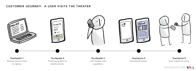
During a customer journey, a user may interact with an organization several times using different channels. Each of these interaction instances represents a touchpoint between the customer and the organization.


Customer touchpoint is the interface of a product or service with users before, during, and after a transaction. Touchpoints go a long way toward defining customer experience and an organization in general.


Consumer habits are changing to a mobile-first lifestyle. Everyone is a fingertip away. Take the example of airline travelers. 1 in 4 airline leisure passengers worldwide is mobile only. "Mobile only" passengers own smartphones and tablets, but not desktops/laptops. Given these insights, mobile app is a critical part of the customer touchpoint.

The users expect an omnichannel experience. Consider a simple traveler journey from flight shopping to the airport: Users search flights on the mobile app, continues flight booking process on the website, receives tickets over email, completes check-in on mobile app, receives boarding passes over email and mobile phone wallet, enquires about baggage allowance over chatbot (linked to the mobile app and/or website), asks specific questions using voice commands on the app, receives notifications about flight on the mobile app, books a taxi to the airport on the app and finally gets to the airport.

The above example is just one type of customer journey. Some users might book flights on the mobile app and perform other interactions on web/chatbot/email/toll free phone lines. The whole idea of plugging in the mobile app into the customer journey is not forceful in this context, rather the need of the hour because users *ARE MOBILE* most of the time.


What about Progressive Web Apps?


There is no denying that progressive web pages/apps, iOS app spotlight, Android app slices and other recent technologies are simplifying the complexities introduced by mobile apps (like download/install/uninstall hassle, offline availability etc). Having said that, one must note that newer technologies do not necessarily pre-empt older innovations all the time. Rather, some new technologies augment the value offered by older innovations and even take them to a higher level of value.


So, What's the Future for Mobile Apps

The future of mobile apps does not lie in adding to the existing trash pile of mobile apps in the market. The future lies in integrating mobile apps seamlessly into the daily lives so pervasively that they no longer need to be used by unlocking the phone, tapping on a few commands and waiting for them to respond. Take a look at this short video summarizing the work of the great David Rose.

The future I believe in does not rely on how many websites, mobile apps, chatbots or phone channels are stitched together to onboard more users and charge them.

The future I believe in makes technology SO HUMANE that we humans do not have to open a laptop to access a website, or unlock a mobile phone to access an app or put your mouth close to a hardware device and make orders.


The future I believe in works so seamlessly that it almost seems HUMAN without challenging me on my intellect, emotions or privacy.

Sadly, today, we have left ourselves far far behind!

Fortunately, we have some humane things happening around us. Stay tuned!

NOTE: I am talking about the future of mobile apps in my upcoming talk, "Enchanting Experiences - The Future of Mobile Apps" at Sydney. If you are in Sydney, then come say Hi at Test Bash Australia 2018. 

Is Sydney too far or too expensive? Take a look at an old version of this talk HERE

30 September, 2018

Is Your Personal Data Secure? - A Beginner's Guide to GDPR


Are you an individual who worries about your personal data while transacting online?

Are you an organization doing business? Do you think about protecting your customer’s personal data? If not, are you ready to pay fines up to 4% of annual global turnover or more?


Users personal data is in danger. Organizations handling data are in danger. Neither of them knows what is the right way to process and protect this personal data. This article is an attempt to educate you about what GDPR is and how it impacts all of us as individuals and organizations.

Personal Data Security
Given the great technological advancements, globalization and complex flows of personal data, users are increasingly worried about the security of their personal data online. Today, keying in a phone number or email address might reveal users’ personal information at the click of a button, if this data falls in the hands of an irresponsible organization. Are not governments worried? Are there any laws and regulations to protect users? 

What is GDPR
The European Union's new General Data Protection Regulation (GDPR) came into effect on May 25, 2018. The GDPR will apply to organizations processing personal data in the EU and also to organizations outside of the EU who may be targeting, or offering goods and services to individuals within the EU. This regulation gives control to individuals over their data by letting them choose how their data is handled online. GDPR highlights how personal data is captured by organizations and documented, how it is processed and what changes are required to the systems, processing users' personal data to comply with GDPR requirements. 

What GDPR means to Individuals and Organizations
Individuals use many products - be it mobile apps or websites. GDPR expects organizations owning these products to notify users how their personal information is consumed within the products. Products working with third party partners must have a personal data policy and a privacy policy to ensure there is no threat to the data when it changes hands from one entity to another.

Basic Definitions
Personal Data
Any information related to a natural person, that can be used to directly or indirectly to identify the person is Personal Data. 
It can be anything from a name, a photo, an email address, bank details, posts on social networking websites, medical information, or a computer IP address.

Data processor
The entity processing on behalf of and in accordance with the instructions of a data controller. 

Data controller
The entity deciding the means and purpose of the processing of personal data. 

What will change?
Under the GDPR, the obligations on data controllers will substantially increase and, importantly, data processors will also now have data protection obligations. For example:


  1. Data controllers and processors alike will now be required to keep records of their processing. 
  2. Contracts with processors will need to be updated with new mandatory provisions. Privacy notices will need to be updated. 
  3. “Consent” will be more difficult to obtain and may need to be refreshed. 
  4. Principles of “privacy by design” mean that organisations must look at their processing and assess whether it is imperative. 


Privacy rules around the world are tightening. The GDPR is just one example of a regime change which aims to put the rights of the individual first. Many of the principles are similar in privacy regimes around the world, but the GDPR is often stricter. Although compliance with the GDPR will not guarantee compliance with all privacy regimes across the globe, it will help to reduce global risks.

16 September, 2018

The One Thumb, One Eyeball Test


Imaging that your user is on their phone, standing in the bus, surrounded by distractions and your app has to hold their attention. They must be able to use your product using an average thumb. If they can’t, you fail the One Thumb, One Eyeball test, and will lose users.

A woman using the mobile phone with one hand on a beach

Many mobile products have call to action buttons that are either too small, or placed too close together, or links are confusing, or new unwanted windows pop up. As soon as you redirect someone to a screen they didn’t want or expect, they’ll lift their head up and your product has lost. Users should be able to complete critical tasks quickly without losing focus. This means all the critical tasks are "do-able"using one thumb and one eyeball what come may - be it standing in the bus, leaning on to the wall at train station, sitting in a congested place at work, comfortably lying down on the couch or even better, sitting on the beach.

One Thumb, One Eyeball Test
People use mobile phones everywhere and anywhere. They are often distracted away from their mobile phones to get some work done or distracted by mobile phones to do some physical work without dropping the phone down. This forces them to use the mobile phone by investing only one eye and one thumb. This enables high speed interaction using one hand needing short attention spans.

The one thumb, one eyeball test was proposed by Luke W during the design of “Polar”, an app designed to create photo polls and allow voting on them. 


The objective was that a user should be able to create a new poll in less than a minute using only one thumb to do so. This test is now a global standard for mobile apps across the world.

Moving away from Hamburger to Tab bar design
Hamburger menu placed in top left corners of the app are too hard to access. Take a look:


A user who is driving a car needs to use the phone in one hand with the other hand on the steering wheel. If the app hamburger is in the top-left corner, the one thumb use case fails. In other words, users must be able to perform critical tasks on the mobile app with just one thumb in a few seconds. Lesser the time (in seconds), the better. Users work in micro-moments - small units of time with distracted attention. Hence the need for speed.

In the above app, notice that most of the critical tasks like My Flights, Today's Deals, Booking are easily accessible using one thumb. This is the freedom users need.

Takeaway
Effective mobile designs must accommodate for one eye and one thumb experiences.

If people can get things done in time sensitive, limited mobility situations, they'll be even more efficient and products will have their full attention.


02 April, 2018

The Big Three Questions .... and User Research


This article was originally published on Linked In.

So, Life happens. I took an unplanned break from writing for past few months. The good news: I am back :). Without further ado, let us get started. I'll touch upon my experience of doing user research over past few years in this article.

What is User Research
User Research is the process of understanding the *impact of design* on an audience with a focus on users’ behavior, needs, and motivation.

Why do we need User Research?


1. To create designs that are truly relevant to people

2. To create designs that are easy and pleasurable to use

3. To understand the return on investment (ROI) of your user experience (UX) design

What is Wrong with User Research
We humans think that we are driven by rationality. Yet, we are far from it. How we behave is based on the heuristics and biases we have. These, in turn, influence the decision we make and the problems we solve. This is precisely why conclusions from user research may not improve the experience of the product. It is not that user research methods are faulty. It is because what people say about their motivations and behavior is far from what motivates them to behave in a real environment. Hence, observations about them during interviews may not capture the whole story.

How to Fix it
Jeff Gothelf talks about The Big Three Research Questions in his book, The Lean UX.

1. Is there a need or opportunity? 
Identify a strong need or opportunity as this is critical to successful user research. This can be done through Observations and Interviews.

2. Do people value my proposed solution? 
Today, products suffer from feature bloats. Asking if the proposed solution for the identified need/opportunity is something people value. The value of the proposed solution can be measured using interviews. If people don't value the solution, there is no point building the solution. Just discard that need and move on to the next one.

3. Can people use my proposed solution? 
Building a solution without validating if people can use that solution is a waste of time and money. A good alternative is to build a simple prototype of the solution and watch people use it by performing usability testing and interviews.

The above research questions apply not just for user research, but for any problem you are trying to solve.

Next time around, when someone seeks user research, ask them what value are they looking for?


29 January, 2018

Flight Maps and Natural Mapping


This article was originally published on Linked In.
Interactive flight maps are a great way to kill time on long-haul flights. Few In-Flight Entertainment (IFE) systems get the geography wrong on these maps. Take a look at this one, I happened to be in last year.


On a standard world map, we know that Auckland is far far away from Kuala Lumpur to its right. On this map shown above, representation shows that Kuala Lumpur is to the right of Auckland, and the flight is flying from Auckland to Kuala Lumpur.
As you may notice, a natural mapping is missing on the interactive map since the location of Auckland and Kuala Lumpur are reversed.
Mapping is a technical term meaning the relationship between two things. Consider the steering wheel in a car. To turn the car to the right, one must turn the steering wheel clockwise, so that its top moves to the right. This mapping is easily learned and always remembered while changing directions of the car. In fact, turning the car to the right maps naturally with our right arm turning to the right, as a mental model. This is natural mapping, natural because it naturally maps to how humans use their body and mental models. The human mind is trained for natural mapping.
Natural mapping takes advantage of physical analogies and cultural standards (Another example — red traffic light means stop; green means go).
Great products apply natural mapping to design enchanted experiences.