Showing posts with label Natural Mapping. Show all posts

29 January, 2018

Flight Maps and Natural Mapping


This article was originally published on Linked In.
Interactive flight maps are a great way to kill time on long-haul flights. Few In-Flight Entertainment (IFE) systems get the geography wrong on these maps. Take a look at this one, I happened to be in last year.


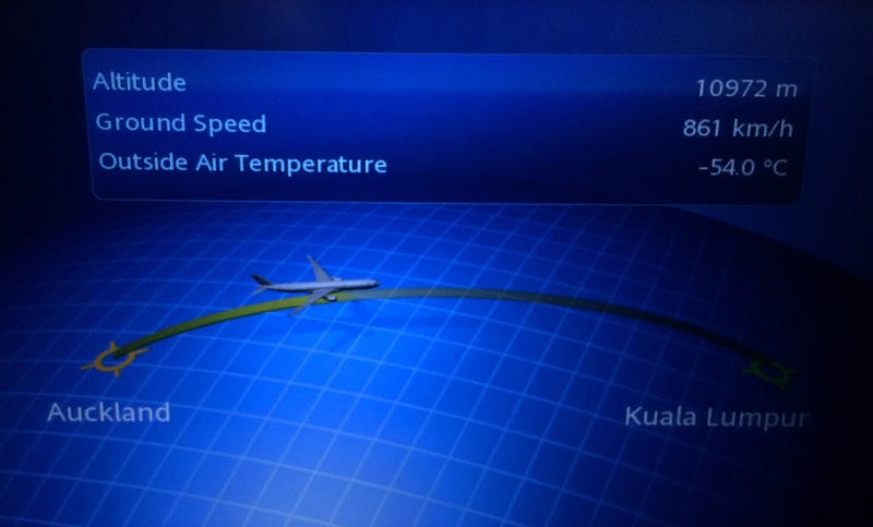
On a standard world map, we know that Auckland is far far away from Kuala Lumpur to its right. On this map shown above, representation shows that Kuala Lumpur is to the right of Auckland, and the flight is flying from Auckland to Kuala Lumpur.
As you may notice, a natural mapping is missing on the interactive map since the location of Auckland and Kuala Lumpur are reversed.
Mapping is a technical term meaning the relationship between two things. Consider the steering wheel in a car. To turn the car to the right, one must turn the steering wheel clockwise, so that its top moves to the right. This mapping is easily learned and always remembered while changing directions of the car. In fact, turning the car to the right maps naturally with our right arm turning to the right, as a mental model. This is natural mapping, natural because it naturally maps to how humans use their body and mental models. The human mind is trained for natural mapping.
Natural mapping takes advantage of physical analogies and cultural standards (Another example — red traffic light means stop; green means go).
Great products apply natural mapping to design enchanted experiences.


    09 May, 2017

    How Linked In Got Skeleton Screens Wrong


    A skeleton screen is essentially a blank version of a page into which information is gradually loaded.
    Luke Wroblewski introduced Skeleton Screens in 2013 through his work on the Polar app, later acquired by Google. I also wrote a short write-up on Facilitating Better Interactions Using Skeleton Screens last year by applying it to mobile apps.
    Following Luke's work and Medium's implementation of skeleton screens for images, Linked In implemented it roughly a year ago. The Linked In team picked few pages/screens for this implementation.

    Notifications


    The skeleton screen on the mobile web appears as shown in the screenshot above. The content appears to load in a gradually revealing fashion. It looks neat and clean.

    So, What Went Wrong with Linked In Implementation?


    Let us consider Notifications screen on Linked In, accessed over a mobile device. There are many additional elements on the actual screen, compared to the number of elements on the skeleton screen. For example, the carousel section, time component and ‘Send InMail’ button are not present in the skeleton screen. The user looks for a 1:1 content mapping which is missing in this case, hence leading to greater confusion.

    Can This Be Fixed?
    As you might notice, a natural mapping is missing in the Notifications screen.
    Mapping is a technical term meaning the relationship between two things.
    Consider the steering wheel in a car. To turn the car to the right, one turns the steering wheel clockwise (so that its top moves to the right). The mapping is easily learned and always remembered.

    Natural Mapping
    Natural mapping takes advantage of physical analogies and cultural standards (Another example - red traffic light means stop; green means go). The human mind is trained for natural mapping. As a result, products, in general, should exploit natural mapping to design enchanted experiences.

    Skeleton screens need a worthy implementation. When poorly done, users are put off by the experience rather than feeling joyful about it.

    How do you want your users to feel?