Showing posts with label MindfulUX. Show all posts

28 June, 2017

How To Educate Mobile Users Using Contextual Tutorials

You heard good things about an app. You downloaded and installed it. You launched the app. You are faced with 7-screen long swipe tutorial that educates you about each and every feature in the app. You hope to remember the features like a memory expert would. Except that, you won't! Mobile app tutorials make or break the app based on their design. Let's take a look at two types of tutorial and which one of these creates a positive impact on users.
 1. Screen by Screen Tutorial

Pulse app throws a big help file called Quick Tutorial educating the user about 4 gestures. The first thing the user does is to 'Dismiss' this screen, due to cognitive overload. As he uses the app thereafter, he struggles to recollect which gestures are mapped to which tasks. In many apps, a quick tutorial is a first-time launch screen that disappears into wilderness forever. Users end up uneducated.
Another example is a static tutorial like the one above. Perhaps, some users take a screenshot and store it. In this case, user's don't just forget the tutorial, but they even forget where the screenshot was stored in the first place. End solution - uninstall the app, reinstall and re-launch the app. Easy. Isn't it?

NO!

Users don't install apps to get a Ph.D degree in How to use your app. They want to accomplish their primary goal, quickly. They are least interested in browsing a 7 screen tutorial on app design features.

Conventional wisdom states that tutorials/static educational screens must be displayed at first launch of the app. Users must go through the learning process (if you are lucky, there'll be a skip option), before proceeding to use the app. This works best in a world where tasks happen in a linear sequence - one task after the other. Sadly, tasks are non-sequential, occurring in a random manner. This leads to remembering features, gestures or ideas difficult.

2. Contextual (Just In Time) Tutorials
A contextual (just-in-time) tutorial is displayed just in time when the user needs it. A contextual tutorial tells the user what is the right thing to do at that moment in time, without referring to the previous or next screen. It provides relevant and necessary information, unlike screen by screen tutorial which throws loads of information at once, irrespective of which flow the user might be using.

Contextual tutorials can be used to educate users in multiple ways:
a. Interactive Tour, One Feature At A Time

Elk is a currency converter app with simple UI. A user can convert a value from one currency to another for whole numbers and decimals. For e.g., a user can seek conversion of 10.35 INR to HUF. This app doesn't show a long tutorial at first launch. Instead, the feature is introduced step by step, the app waits for the user to try the step, understand it and then move on to next feature. Interactive tour works well for complex apps.

b. When Users Commit Errors
When users commit errors, it is common practice to display an error message, educating the user. It turns out, users don't want to be educated. Rather, they love to be guided when they go wrong. On Wego app, when the user forgets to select travel dates during flight booking, a simple action dulls rest of the screen and highlights just the departure and arrival dates, indicating that user needs to enter this data to proceed. This is a delightful way to tell users how exactly they went wrong, where they went wrong and how to fix it. The job is done well.

Users are no longer excited about elaborate onboarding ceremonies before performing their task. They want to setup the app as quickly as possible, complete the task on hand and get out. It's best to think of contextual/just in time education as improving the quality of lives users have by creating delightful experiences for them.

Do you have a contextual tutorial in your app?


22 May, 2017

How to Improve Payment Forms Using Four Interaction Design Patterns on Mobile Devices

This article was originally published on Linked In.


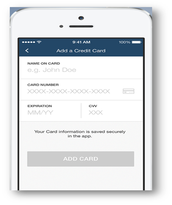
Payment forms are critical on mobile apps, to sell products online. Conventional payment forms have at least 4 input controls — Name on Card, Card Number, Expiry Date, CVV and in some cases, even Card Type — Visa, Mastercard, American Express and so forth. We seek card type although we can detect which type of card it is using first two digits of the card number. We seek detail to this level in the name of providing freedom and control to users.


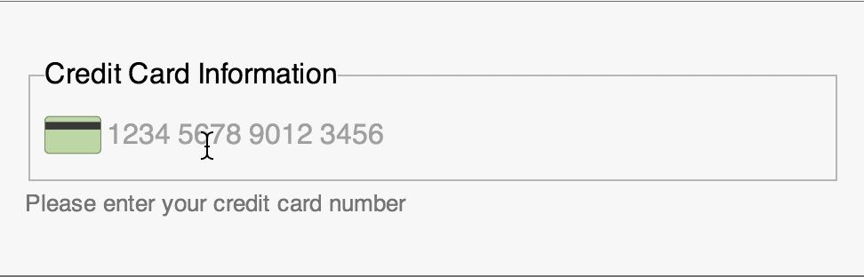
Typing through each field, by looking intermittently at the card and the payment form to ensure correctness can be a daunting task. Payment form listed above can be simplified by reducing the number of input controls from 4 to 1.


Great! It’s a given that this single input control gathers all the information previously done but in a more elegant and simplified way.

Interaction Design Patterns
Good experience only begins from here — the single input control. Four intuitive interaction design patterns can be used to improve the input experience further.

1. Contextual Keypad
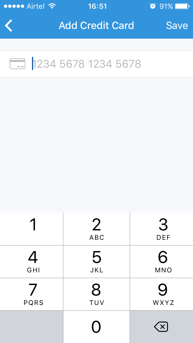
Tapping on the card number field displays a keypad. A lot of mobile apps display qwerty type keypad. The user has to switch to the numeric keypad with few taps to enter the card number.


Reducing the effort required to switch between multiple keypads while entering input is a big relief to users. Displaying a numeric keypad (input type=tel) since.

2. Input Masks
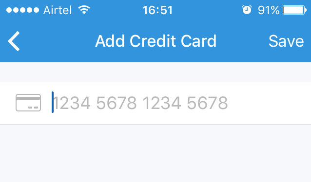
As a user types the card number, after typing first 4 digits, he/she pauses to decide whether to give space or hyphen symbol. The user needs intuitive guidance here on which separators (space/hyphen) to use and how many digits are remaining.


Input mask is the answer. Input mask can be implemented in many ways:
  • Use ‘XXXX-XXXX-XXXX-XXXX’ and gradually reveal the input structure as user types along
  • Use real text like ‘Expiry Date’, ‘CVV’ to hint users
  • Auto-populate card logo based on card number as user types first two digits of the card number. This provides feedback to the user that he/she has indeed, entered the right card number.
3. Animation
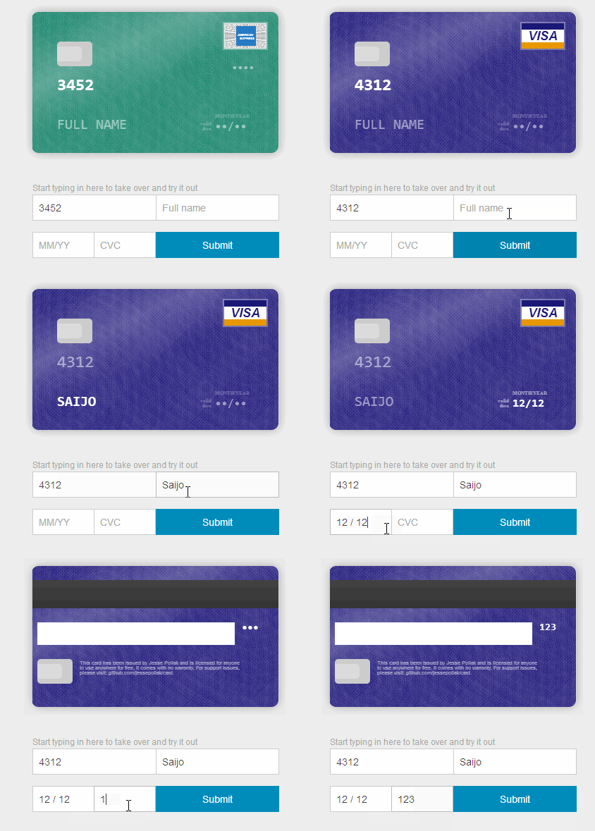
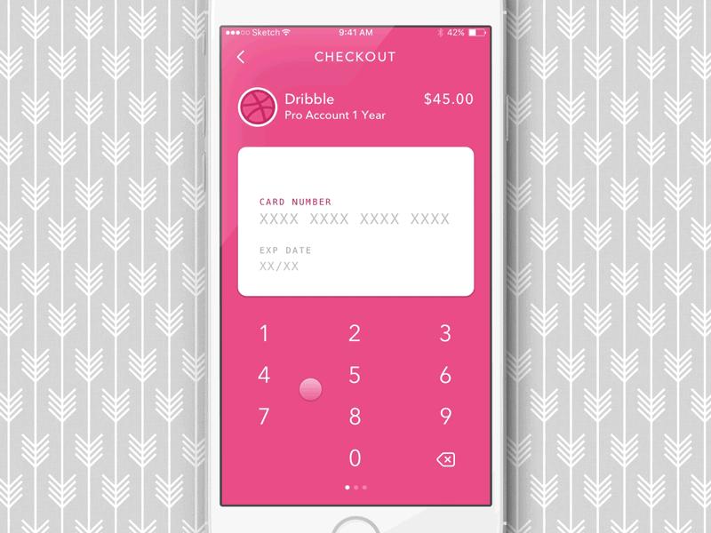
An improved design pattern for payment forms is to introduce animation using card metaphor by designing a virtual card layout. As a user enters the data, it is auto-populated on the card to give a real card visual experience.


4. Machine Input
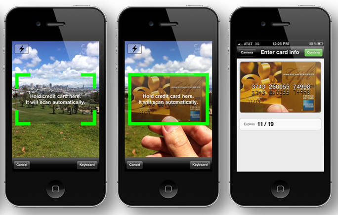
Tired of typing input manually? There is a simpler pattern :). The built-in camera on mobile phones can be used to retrieve card information by just scanning the card.


The user doesn’t need to enter card number manually anymore. Many mobile apps are adopting this approach these days [This approach might need intense machine learning algorithms to work with precision.]

Using small/big fingers on small screens to perform input operations can be challenging for many users. Payment forms are particularly risky given the secure nature of operations. Intuitive interaction design patterns listed above can soothe stressed out users by simplifying payment forms to a large extent.
How simple are the forms in your apps?

09 May, 2017

How Linked In Got Skeleton Screens Wrong


A skeleton screen is essentially a blank version of a page into which information is gradually loaded.
Luke Wroblewski introduced Skeleton Screens in 2013 through his work on the Polar app, later acquired by Google. I also wrote a short write-up on Facilitating Better Interactions Using Skeleton Screens last year by applying it to mobile apps.
Following Luke's work and Medium's implementation of skeleton screens for images, Linked In implemented it roughly a year ago. The Linked In team picked few pages/screens for this implementation.

Notifications


The skeleton screen on the mobile web appears as shown in the screenshot above. The content appears to load in a gradually revealing fashion. It looks neat and clean.

So, What Went Wrong with Linked In Implementation?


Let us consider Notifications screen on Linked In, accessed over a mobile device. There are many additional elements on the actual screen, compared to the number of elements on the skeleton screen. For example, the carousel section, time component and ‘Send InMail’ button are not present in the skeleton screen. The user looks for a 1:1 content mapping which is missing in this case, hence leading to greater confusion.

Can This Be Fixed?
As you might notice, a natural mapping is missing in the Notifications screen.
Mapping is a technical term meaning the relationship between two things.
Consider the steering wheel in a car. To turn the car to the right, one turns the steering wheel clockwise (so that its top moves to the right). The mapping is easily learned and always remembered.

Natural Mapping
Natural mapping takes advantage of physical analogies and cultural standards (Another example - red traffic light means stop; green means go). The human mind is trained for natural mapping. As a result, products, in general, should exploit natural mapping to design enchanted experiences.

Skeleton screens need a worthy implementation. When poorly done, users are put off by the experience rather than feeling joyful about it.

How do you want your users to feel?


19 April, 2017

Facts, Figures, Data OR Good Experiences?


Take any weather app. It tells you precisely the weather for any particular day.
Planning for an overseas trip? Look up the weather app.
Visiting family in your home town? Look up the weather app. 
Sadly, all the weather apps do is to throw 'weather data' at you for different days and weeks. 

Can we make it better?


Throwing data at users is one way of interacting with users. Analyzing readily available data and making suggestions to users is another, in fact, better way of interacting with users. 


The Facebook website shows weather forecasts on days with unusual weather changes. For e.g., a hot day that is unusually hot, an unexpected rain or storm and so forth. This experience delights users, not the data.

User's joy is driven by good experiences, not facts/figures/data.

Do you throw data at your users?